We look forward to showing you Velaris, but first we'd like to know a little bit about you.


What to Include on a Customer Onboarding Dashboard
Discover the essential components of a customer onboarding dashboard, from progress tracking to task management.
The Velaris Team
March 14, 2026
A customer onboarding dashboard is a centralized command center that tracks customer progress, behavior, and risk signals during the critical activation period. It’s built for Customer Success teams, onboarding specialists, CS leaders, and RevOps teams who manage multiple customer journeys at scale and need clear visibility into who is progressing, stuck, or at risk.
Use it whenever your team is handling more onboarding accounts than can be reliably managed from memory or scattered tools, especially when running both high-touch enterprise onboarding and low-touch, self-serve motions that require a mix of deep account tracking and automated, data-driven monitoring.
Key Takeaways
- A customer onboarding dashboard centralizes CRM, product, support, and engagement data to give CS teams real-time visibility into onboarding progress and risk.
- Time to First Value (TTFV), activation rate, and onboarding completion rate are the most predictive metrics of long-term retention.
- High-touch dashboards focus on milestones, stakeholders, integrations, and custom success goals, while low-touch dashboards prioritize automation, usage data, and health scoring.
- Effective dashboards highlight bottlenecks, drop-off points, and milestone delays so teams can fix friction before it drives churn.
- Role-based views ensure executives see trends and revenue impact, while CSMs see tasks, risks, and next best actions.
- The best onboarding dashboards don’t just report data, they trigger workflows, alerts, and interventions that turn insight into action.
Importance of customer onboarding dashboards
Customer onboarding dashboards have become essential tools for scaling Customer Success teams. When you're orchestrating dozens or hundreds of customer journeys simultaneously, visibility isn't just nice to have, it's what separates reactive firefighting from proactive success management.
The right dashboard transforms scattered data into actionable intelligence. It shows you which customers are thriving, which are stuck, and exactly where to focus your team's energy for maximum impact.
How to manage multiple customer onboarding journeys
A centralized onboarding dashboard solves the fundamental problem of distributed information. Instead of context-switching between your CRM, product analytics, email platform, and project management tool, you see everything that matters in one place.
The benefits compound quickly:
Response times drop dramatically through centralized visibility. When a customer shows signs of struggle, you see it immediately rather than discovering it three days later during a manual check-in.
Consistency improves across your team. Junior CSMs can see exactly what's been done and what's next, following the same proven playbook that your senior team uses.
Pattern recognition becomes possible. When you can see 50 onboarding journeys side-by-side, you spot which steps commonly create friction and can fix them systematically.
Executive reporting becomes trivial. Instead of spending Friday afternoon cobbling together status updates, you pull real-time metrics in seconds.
The right dashboard fundamentally changes how your team works.
Low-touch vs high-touch onboarding
Not all onboarding requires the same level of human involvement. Understanding this distinction shapes everything about your dashboard design.
High-touch onboarding applies to enterprise customers and strategic accounts with dedicated CSMs. These customers expect white-glove service: personalized kickoff calls, custom implementation plans, executive alignment, and proactive outreach.
Low-touch onboarding serves customers who succeed primarily through self-service. These might be smaller accounts, product-led growth customers, or anyone in your digital-first segment. They engage through automated emails, in-app guidance, and help documentation.
Because most organizations run both models simultaneously, your dashboard architecture should accommodate both, letting you manage enterprise customers with precision while monitoring hundreds of self-serve customers for patterns and exceptions.
To dive deeper into the strategic differences between these approaches, read our comprehensive guide on low-touch vs high-touch customer success.
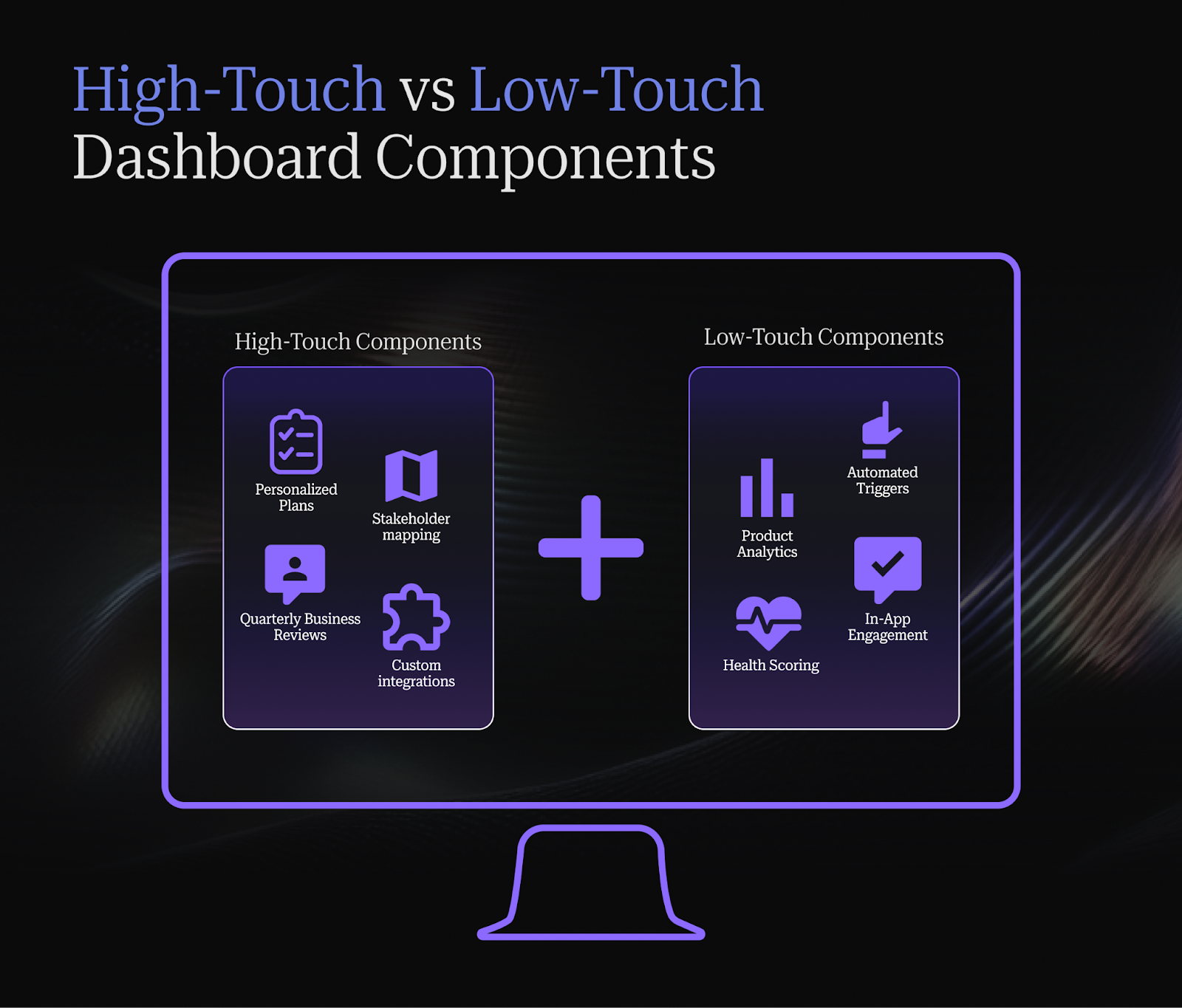
Dashboard components for high-touch customers
Enterprise and strategic accounts with dedicated CSMs need dashboards built for depth and personalization.
Personalized onboarding plans and milestones
Each enterprise customer should have a customized onboarding plan visible on your dashboard. This includes agreed-upon milestones, success criteria specific to their business objectives, and timeline commitments you've made.
The dashboard makes these plans actionable. CSMs see upcoming milestones, can track progress against the plan in real-time, and get alerted when timelines slip. Customers can access their plan too, creating mutual accountability.
Stakeholder mapping and engagement tracking
Enterprise deals involve multiple stakeholders with different priorities. Your dashboard should map the organizational structure, track engagement levels for each stakeholder, and flag when key decision-makers go dark.
This means tracking: Who's the economic buyer? Who's the technical champion? Who are the end users? When did you last interact with each? What's their engagement trend?
When your executive sponsor hasn't logged in for three weeks, your dashboard should alert you before they become a renewal risk.
Executive business review scheduling
QBRs and EBRs are critical touchpoints for enterprise customers. Your dashboard should track when the last review happened, when the next is scheduled, and prompt CSMs to prepare materials in advance.
Smart teams also track EBR outcomes like commitments made, action items, and follow-through rates. This transforms executive reviews from status updates into strategic planning sessions.
Custom success criteria and goals
Enterprise customers have unique definitions of success. Your dashboard should track customer-specific KPIs alongside your standard metrics.
Maybe their success means processing 10,000 transactions monthly, or reducing their manual work by 30 hours per week, or improving their NPS by 15 points. Whatever they care about, you should be tracking it and showing progress.
Custom integration requirements tracking
Enterprise onboarding often depends on technical integrations. Your dashboard needs to track integration status: which systems need connecting, what's the technical complexity, who owns it on their side, what's blocking progress.
When an integration is 80% complete but stalled for two weeks, your dashboard should surface that before it derails the entire onboarding.
Training session attendance and tracking
Track which stakeholders attended which training sessions, what materials were shared, and what follow-up occurred. If only 3 of 15 licensed users attended training, you have an adoption problem waiting to happen.
Advanced teams also track post-training engagement, such as looking into whether attendees actually started using the features they learned about?
Dashboard components for low-touch customers
Self-serve, digital-first, and tech-touch customers need dashboards built for automation and pattern recognition.
Automated task management and trackers
Low-touch customers move through your onboarding based on behavioral triggers, not scheduled calls. Your dashboard should automatically assign next steps based on customer actions.
When a customer completes setup, trigger the next email sequence. When they haven't logged in for 5 days, trigger a re-engagement campaign. When they use a specific feature, trigger educational content about related capabilities.
The dashboard shows you which automations are firing, conversion rates at each step, and where customers are dropping off in your automated flows.
Product usage analytics and feature adoption
For self-serve customers, product usage is your primary communication channel. Your dashboard should show cohort-level usage patterns, feature adoption curves, and early signals of customer health.
Track: What percentage of users log in weekly? Which features have high initial adoption? Which features correlate with retention? Where do users spend their time?
This data tells you which parts of your product create value and which create friction.
In-app engagement metrics
In-app messages, tooltips, and walkthroughs guide self-serve customers. Your dashboard should track engagement with these elements.
Are customers completing your onboarding checklist? Which tooltips get dismissed immediately? Where do users request help? This shows you which guidance actually helps versus which just annoys users.
Self-service resource consumption
Track which help articles customers read, which videos they watch, and how long they spend with educational content. High consumption of specific resources often indicates either strong engagement (good) or systematic confusion (bad).
The pattern matters: customers who engage with educational content typically succeed faster than those who try to figure everything out themselves.
Automated email campaign engagement
Your automated email sequences should have clear success metrics on your dashboard. Track open rates, click rates, and most importantly, the actions customers take after receiving each email.
If your "complete setup" email has a 40% open rate but only 5% of recipients actually complete the setup, either the email isn't compelling or the setup process itself has problems.
Cohort-based progress comparison
Compare how different customer cohorts move through onboarding. This week's signups versus last month's. Customers from different acquisition channels. Different plan tiers or company sizes.
Cohort analysis reveals whether recent product changes improved onboarding and which customer segments need different approaches.
Automated health scoring and risk alerts
Low-touch customers can't all get manual attention, so your dashboard needs intelligent automation. Health scores should aggregate multiple signals: product usage, engagement trends, feature adoption, support interactions.
When a customer's health score drops below threshold, your dashboard should alert the right person or trigger an automated intervention. You can't manually monitor 500 self-serve customers, but you can respond quickly to the 15 who show warning signs.
For a closer look at how to structure health monitoring across your full portfolio, see our guide to customer health dashboards and what effective health scoring setups look like in practice.
Key metrics and KPIs to track on your onboarding dashboard
The metrics you track determine what you optimize for. Choose wisely, because what gets measured gets managed.
Core onboarding metrics in customer onboarding
Time to First Value (TTFV) measures how quickly customers experience their first meaningful outcome with your product. This might be completing their first workflow, generating their first report, or processing their first transaction. TTFV predicts long-term retention better than almost any other early signal.
Research confirms this impact: products with TTFV under 10 minutes see 3x lower abandonment compared to those exceeding 30 minutes, while each 10-minute reduction in TTFV drives 8-12% gains in activation rates. Even more compelling, cutting TTFV in half (from 30 to 15 minutes) can boost 7-day retention by 25-40%.
For strategies on reducing time-to-value across your customer base, explore our guide to reducing time-to-value for faster customer success.
Onboarding Completion Rate tells you what percentage of customers successfully finish your onboarding program. If only 60% complete, you're likely losing 40% who never fully activated. This metric reveals whether your process is too complex, too long, or missing critical support touchpoints
The stakes are high: 70% of SaaS users churn within 90 days primarily due to incomplete onboarding or failure to perceive value, making this your most critical early indicator..
Customer Activation Rate tracks how many customers reach your defined "activated" state, typically using core features regularly enough to build habits. An activated customer has crossed the chasm from trying your product to relying on it.
The data validates this approach: customers who activate within the first 7 days show 90% higher likelihood of long-term retention, with top-performing products achieving day-7 activation rates that correlate 69% with sustained engagement.
Time-based metrics in customer onboarding
Average Onboarding Duration reveals how long customers typically take from signup to full activation. Track both your target timeline and actual performance. Large gaps indicate either unrealistic expectations or systematic friction points.
Time to Key Milestones breaks down your overall timeline into specific checkpoints. How long until they complete setup? Until they invite their team? Until they run their first analysis? Milestone-level data shows you exactly where customers get stuck.
Time to First Login (for team members) matters especially for B2B products. If the account owner signs up but their team never logs in, your expansion potential dies before it starts.
Engagement and adoption metrics in customer onboarding
Product Usage Frequency measures how often customers actually use your product during onboarding. Daily active users convert at higher rates than weekly users. Declining frequency is your earliest warning sign of disengagement.
Feature Adoption Rates show which capabilities customers discover and use during onboarding. If critical features have low adoption, either your onboarding isn't surfacing them properly or customers don't yet understand their value.
Support Ticket Volume During Onboarding can signal either healthy engagement (customers diving deep enough to hit questions) or problematic friction (basic confusion). Context matters, so track both volume and resolution time.
Conversion and revenue metrics to track in customer onboarding
Trial to Paid Conversion Rate is your ultimate onboarding success metric for freemium or trial-based products. Everything else is a leading indicator; this is the lagging indicator that matters to your CFO.
Industry benchmarks show trial conversion rates typically range from 10-20%, with each 10% increase in activation driving 6-10% uplift in conversions.
Expansion Revenue from Onboarded Customers tracks how effectively onboarding sets the foundation for growth. Customers who adopt multiple features during onboarding typically expand faster.
Early Churn Rate measures customers who cancel during or immediately after onboarding. This is your most expensive form of churn, since you’ve invested in acquisition and onboarding with zero return.
The impact of prevention is substantial: complete onboarding experiences reduce churn risk by 80-90% compared to incomplete journeys, making this your highest-leverage optimization opportunity.
The sophisticated move: track these metrics both individually and as a cohort analysis over time. This reveals whether your improvements actually work or just coincide with seasonal variations.
Dashboard design and optimization best practices
Even the right data becomes useless if poorly presented. Dashboard design determines whether your team uses it or ignores it.
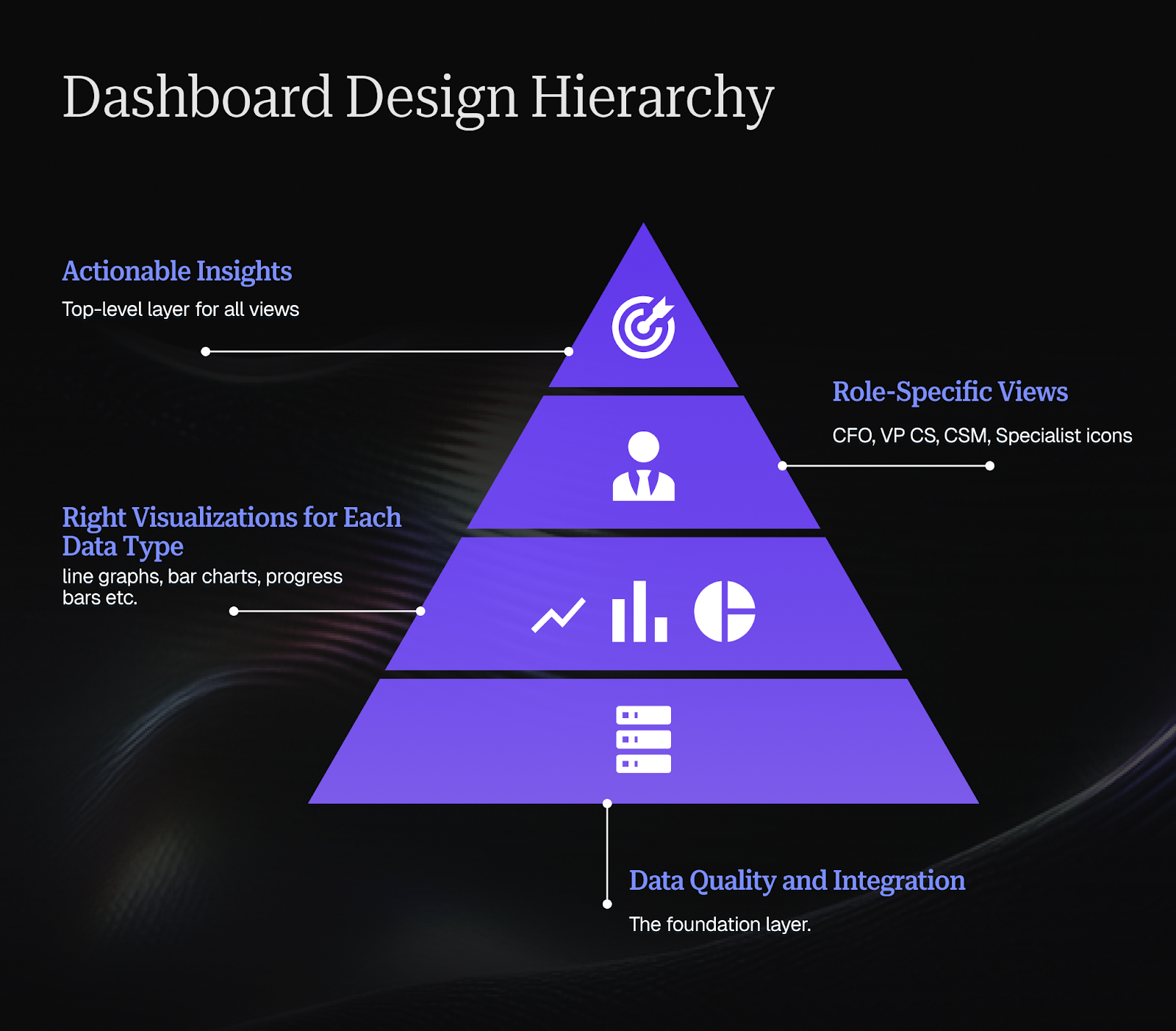
How to choose the right visualizations for an onboarding dashboard
Different data types need different visualizations.
Time-series trends work best as line graphs showing change over time. Is TTFV improving? Show a line graph comparing monthly cohorts.
Progress tracking needs progress bars or completion percentages. How many customers are at each onboarding stage? Show a funnel visualization.
Comparisons benefit from bar charts. How do different customer segments perform? Show bars for each segment's activation rate.
Distributions require histograms. How long does onboarding typically take? Show a histogram of all customer durations.
Single important numbers deserve big, clear displays. What's your current trial conversion rate? Show it in large text with trend direction.
The wrong visualization forces viewers to work hard to extract meaning. The right visualization makes insights obvious at a glance.
How to balance real-time vs historical views
Real-time data shows you what's happening now and demands immediate action. Historical data reveals patterns and informs strategic decisions.
Your dashboard needs both, but clearly separated. Real-time views should highlight exceptions and urgency: "These 5 customers need attention today." Historical views should show trends: "Our activation rate improved 12% over the last quarter."
Most teams default to real-time everything, creating alert fatigue. Build intentional historical views that update weekly or monthly, giving your team space to think strategically.
How to avoid information overload
More metrics don't equal better decisions. Information overload leads to paralysis.
Follow the 5-second rule: can someone look at this dashboard section and understand the key insight in 5 seconds? If not, simplify.
Use progressive disclosure: show high-level summaries first, let users drill into details when needed. Don't dump 50 metrics on one screen.
Remove vanity metrics that look interesting but don't drive action. If knowing something doesn't change what you do, don't track it prominently.
How to create role-specific dashboards
Your CFO, your VP of CS, your CSM team, and your onboarding specialists all need different information.
CFO view: Financial metrics, conversion rates, revenue impact, ROI of onboarding investments.
VP of CS view: Team performance, capacity utilization, strategic trends, departmental KPIs.
CSM view: Individual customer health, upcoming tasks, at-risk accounts, execution details.
Onboarding specialist view: Pipeline of new customers, completion rates, common friction points, resource effectiveness.
Build role-specific views rather than making everyone filter the same massive dashboard. This reduces cognitive load and increases adoption.
For more insights on building effective dashboards tailored to your team's needs, explore our article on building a customer success dashboard.
Technical implementation of your onboarding dashboard
Great dashboards require solid technical foundations. Cutting corners on implementation creates maintenance headaches and data trust issues.
How to select the right tools and platforms
Your options range from building custom dashboards to using specialized CS platforms to configuring general-purpose BI tools.
Specialized AI-native CS platforms like Velaris, recognised on G2 for its ease-of-use and customer support, are purpose-built for the future of post-sales, where intelligent automation handles 80% of routine activities while empowering CS teams to focus on strategic orchestration.
CS platforms don't just track data; they act as the connective layer between Customer Success, Onboarding, Support, and Account Management, using AI agents to surface insights, flag risks, and recommend actions. The advantage is speed to value with built-in intelligence that evolves with your needs, eliminating the data engineering bottlenecks that slow down custom solutions.
Business intelligence tools like Tableau, Looker, or Mode give you maximum flexibility. The advantage is you can visualize anything. The tradeoff is you're building everything from scratch, requiring technical resources.
Custom-built solutions offer complete control. The advantage is perfect fit for your exact needs. The tradeoff is high development and maintenance costs.
Most growing CS teams find purpose-built CS platforms offer the best balance: sophisticated dashboards without requiring data engineering resources.
How to integrate multiple data sources
Effective onboarding dashboards pull data from multiple systems:
- CRM data: Account details, contract information, company size
- Product analytics: Feature usage, login frequency, session duration
- Email platform: Campaign engagement, email responses
- Support system: Ticket volume, resolution time, satisfaction scores
- Meeting data: Call recordings, attendance, outcomes
- Financial system: Payment status, plan tier, revenue
Each integration creates potential points of failure. Use platform-native integrations when available rather than custom API connections. They're typically more reliable and get updated when source systems change.
Prioritize integrations that feed your most critical metrics. You can add nice-to-have data sources later.
How to set up automated data pipelines
Manual data updates create gaps and inconsistencies. Automated pipelines keep your dashboard current without ongoing human effort.
Define your refresh requirements by data type:
- Real-time: Customer health alerts, task assignments, critical updates
- Hourly: Product usage data, email engagement, support tickets
- Daily: Most operational metrics, customer progress tracking
- Weekly: Trend analysis, cohort comparisons, executive reporting
More frequent updates consume more resources. Don't refresh daily data every 5 minutes just because you can.
Build error handling into your pipelines. When an integration breaks, you need alerts and fallback data so your team doesn't operate on stale information.
How to ensure data quality and accuracy
Dashboards are only valuable if your team trusts the data. Data quality issues erode that trust fast.
Implement validation checks:
- Completeness: Are all expected data sources updating?
- Consistency: Does the customer count match across different views?
- Accuracy: Do automated calculations match manual verification?
- Timeliness: Is data current within expected refresh windows?
Create a single source of truth for key definitions. When three different dashboards show three different customer counts, you have a problem. Define precisely what "active customer" or "onboarding completion" means, then apply that definition consistently.
Assign data stewardship responsibility. Someone should own dashboard accuracy, investigate discrepancies, and maintain documentation of data sources and calculations.
How to customize your customer onboarding dashboard for your team’s needs
Generic dashboards serve no one well. Customization turns a useful tool into an essential one.
How to tailor dashboards to different roles
We covered role-specific views earlier, but customization goes deeper than just showing different metrics.
Interaction patterns vary by role. CSMs need frequent, quick-check access throughout the day. Executives need periodic deep dives. Configure refresh rates, default views, and notification triggers accordingly.
Decision-making contexts differ. A CSM asking "What should I do today?" needs actionable task lists. A VP asking "How's the department performing?" needs strategic summaries. Build the appropriate decision support for each context.
Technical comfort levels vary. Power users might love custom filters and pivot tables. Others prefer fixed views with clear guidance. Provide both paths.
The goal isn't giving everyone access to everything, but giving each person exactly what they need to do their job well.
How to automate workflows to reduce workload
Dashboard value increases exponentially when viewing leads directly to action without context-switching.
Connect your dashboard to workflow automation:
When a customer's health score drops, automatically create a task for their CSM. When onboarding stalls at a specific milestone, trigger a targeted email sequence. When usage patterns indicate expansion opportunity, alert the account manager.
The dashboard becomes not just a reporting tool but a command center that both surfaces insights and initiates responses. Build feedback loops that track which automated responses succeed, which get ignored, and continuously refine your triggers and actions.
Modern AI-native platforms like Velaris transform dashboards from reporting tools into command centers. When a customer's health score drops, AI agents can automatically analyze the context, create targeted tasks, and even draft personalized outreach, leaving CSMs to orchestrate the response rather than execute every step manually.
This human-machine collaboration is where the future of Customer Success lives: AI handles the repetitive 80%, while CS orchestrators apply judgment and relationship skills to the critical 20%.
How to turn dashboard data into results
Data without action is expensive noise. Great dashboards enable great decision-making.
Identify onboarding bottlenecks
Your dashboard should make bottlenecks obvious. Look for:
High drop-off points: If 80% of customers complete step 3 but only 40% complete step 4, you have a bottleneck. Investigate what makes step 4 difficult and either simplify it or provide better support.
Extended time periods: If most milestones take 2-3 days but one consistently takes 10-14 days, that's a bottleneck. Maybe it requires external dependencies or technical complexity that needs addressing.
Support concentration: If 60% of support tickets during onboarding relate to one specific feature, that feature probably has usability issues requiring product improvements.
Variation by segment: If enterprise customers consistently struggle with a step that SMB customers sail through, you likely need segment-specific approaches.
Once you identify bottlenecks, run experiments to address them. The dashboard should show you whether your fixes work.
Understand industry benchmarks
Context matters. Is your 21-day average onboarding duration good or bad? Depends on your industry, product complexity, and customer segment.
Research relevant benchmarks:
- SaaS industry averages for products of similar complexity
- Competitor performance when publicly available
- Cohort comparisons within your own customer base
Benchmarks inform goal-setting and help you understand where you're genuinely struggling versus where you're facing industry-standard challenges.
Don't let benchmarks paralyze you, though. If the industry average is 30 days but your best customers activate in 10, aim for 10 across the board rather than settling for "above average."
Using cohort analysis for improvement
Cohort analysis reveals whether changes actually work or just seem to work because you wanted them to.
Compare customers who onboarded before and after significant changes:
- Process changes: Did revising your onboarding checklist improve completion rates?
- Product changes: Did the new user interface speed up activation?
- Content changes: Did updated help documentation reduce support tickets?
Without cohort analysis, you're guessing. Seasonal factors, changing customer segments, and random variation can make you think something worked when it didn't, or miss improvements that actually helped. Run cohort analyses with statistical significance in mind. Small sample sizes and short time periods lead to false conclusions.
For a deeper understanding of how to apply cohort analysis to your Customer Success strategy, check out cohort analysis explained: leveraging data to improve customer success.
Implementing A/B testing based on dashboard insights
Your dashboard shows you problems. A/B testing shows you solutions.
When you identify a bottleneck or opportunity, design experiments:
Test different onboarding sequences. Does starting with the "quick win" feature lead to better activation than starting with the "most powerful" feature?
Test content approaches. Does video tutorial work better than written documentation for a complex feature?
Test touchpoint timing. Does reaching out when engagement drops improve outcomes, or does giving customers space work better?
Test segmentation strategies. Do enterprise customers need different onboarding than mid-market customers?
Your dashboard provides the measurement infrastructure. Track test groups separately, measure the same metrics for both, and let data determine the winner. Small, continuous improvements compound. Teams that regularly A/B test onboarding elements outperform those who rely on intuition.
To learn more about key onboarding strategies that can inform your testing, read key customer onboarding strategies to improve retention and advocacy.
Conclusion
Building an effective dashboard requires both breadth and depth. Breadth to monitor large cohorts of low-touch customers. Depth to manage high-touch enterprise relationships. The specific components you need depend on your business model, but the underlying principle remains constant: measure what matters, surface it clearly, and make it actionable.
Ready to see what an AI-native onboarding dashboard can do for your team? Velaris has been recognized on G2 for its ease of use, helping customer success teams create seamless onboarding experiences that drive faster time-to-value.
Book a demo with Velaris to discover how intelligent automation can handle the routine 80% of your onboarding activities, freeing your team to orchestrate exceptional customer experiences.
Frequently Asked Questions
What's the most important metric to track on an onboarding dashboard?
Time to First Value (TTFV) consistently predicts long-term success better than any other single metric. It measures how quickly customers experience meaningful outcomes with your product, which correlates strongly with retention and expansion.
However, no single metric tells the complete story. The right dashboard tracks TTFV alongside activation rates, product usage, and customer health scores to provide comprehensive visibility.
How many metrics should I include on my onboarding dashboard?
Quality beats quantity. Most effective dashboards focus on 5-8 primary metrics with the ability to drill into supporting details when needed.
Start with metrics that directly inform action: completion rates, time to key milestones, customer health scores, and conversion rates. Add metrics only when they reveal insights your current dashboard misses. Too many metrics create paralysis rather than clarity.
Should onboarding dashboards be different for SaaS vs non-SaaS companies?
The core principles apply universally: track progress, identify bottlenecks, measure outcomes. But specific metrics vary significantly. SaaS companies typically focus on product usage, feature adoption, and digital engagement.
Professional services firms might track deliverable completion, stakeholder satisfaction, and billable hours. Physical product companies might emphasize training completion, return rates, and first purchase timing. Adapt the framework to your business model's critical success factors.
How often should I update my onboarding dashboard?
Different data needs different refresh rates. Real-time updates work for critical alerts and task assignments.
Hourly refreshes suffice for product usage and engagement data. Daily updates handle most operational metrics. Weekly or monthly refreshes provide strategic trend analysis without constant noise. Over-refreshing creates alert fatigue; under-refreshing means working with stale data. Match refresh frequency to decision-making cadence for each metric.
What's the difference between a customer onboarding dashboard and a customer health dashboard?
Onboarding dashboards focus specifically on the initial activation period, helping customers achieve their first successes and build sustainable usage patterns. Customer health dashboards monitor ongoing account status across the entire lifecycle. Onboarding is a subset of health, but requires different metrics (time to first value, setup completion) than long-term health (renewal likelihood, expansion potential). Many organizations maintain separate but integrated views for each purpose.
Can small CS teams benefit from onboarding dashboards, or are they only for large enterprises?
Small teams often benefit more from dashboards than large ones. When you're managing 20 customers personally, you might remember details without dashboards. When you're managing 200, systematic tracking becomes essential. Small teams typically start with simpler dashboards, and add sophistication as they scale. The dashboard prevents small teams from drowning in operational details and enables them to punch above their weight.
The Velaris Team
A (our) team with years of experience in Customer Success have come together to redefine CS with Velaris. One platform, limitless Success.

Velaris is an AI-native Customer Success Platform built for mid-market and enterprise B2B SaaS teams. From customer health scoring and churn prediction to onboarding automation, renewals, and expansion workflows, Velaris helps recurring revenue teams understand account health, reduce churn, and scale customer success with greater visibility and control.