We look forward to showing you Velaris, but first we'd like to know a little bit about you.


The Ultimate Guide to Analytics Dashboards for Customer Success Management
See how an analytics dashboard helps Customer Success teams track customer health, automate insights and take action before issues escalate.
The Velaris Team
July 17, 2026
Customer success teams often struggle with scattered data, unclear customer health signals, and the constant challenge of predicting churn before it’s too late.
Without a single source of truth, managers spend more time reacting to problems than driving growth. An analytics dashboard solves these pain points by consolidating key metrics like retention, adoption, and revenue impact into one clear, actionable view.
In this guide, you’ll learn what dashboards are, how they transform customer success management, the essential features to include, and practical steps to build one in Velaris, which is highly rated on G2.
Key takeaways
- Dashboards solve pain points by consolidating scattered data and improving visibility into customer health.
- Core features matter: health scoring, churn prediction, engagement tracking, support analysis, and revenue metrics.
- Velaris makes building easy with KPI definition, data integration, health scoring, role‑specific views, and automation.
- Avoid common mistakes like cluttered metrics, poor data quality, misaligned goals, and static dashboards.
- Follow best practices: set clear KPIs, integrate data, train teams, start simple, and refine continuously.
Why customer success needs analytics
Customer success depends on understanding customers deeply, and analytics make that possible. By tracking health scores, churn risks, and adoption trends, teams gain the clarity to act proactively, strengthen relationships, and directly drive retention and growth.
The challenge is that customer success teams often deal with scattered data usage reports in one system, support tickets in another, and revenue details elsewhere. Without analytics, it’s difficult to see the full customer journey, predict churn, or measure the impact of success initiatives.
An analytics dashboard acts as a central hub that brings all these insights together. It doesn’t just collect data; it organizes it into clear, actionable views that help teams move from reactive problem solving to proactive engagement.
What is an analytics dashboard
An analytics dashboard is a visual interface that organizes and displays data in one place. Instead of digging through spreadsheets or separate reports, a dashboard presents the most important information in a way that’s easy to understand and act on.
Key components typically include:
- Charts and graphs for spotting trends quickly
- KPIs (key performance indicators) to track progress against goals
- Filters to drill down into specific segments or timeframes
- Real‑time updates so teams always work with the latest data
In 2025, over 78% of SaaS companies report dashboards as a core feature for customer engagement and internal decision‑making (Research Report: The State Of Dashboards In 2025).
Unlike raw reports, which often provide static lists of numbers or text, dashboards are interactive and dynamic. Reports tell you what happened, but dashboards show you what’s happening now and highlight where action is needed.
Why customer success teams struggle without analytics
Customer success teams often face major challenges when they don’t have analytics in place. Without a single source of truth, it’s hard to understand customer health, predict churn, or measure retention.
Teams end up reacting to problems instead of preventing them, and valuable time is wasted on manual reporting instead of building stronger customer relationships.
Lack of visibility into customer health
Without analytics, managers can’t easily see whether customers are satisfied, engaged, or at risk. This makes it difficult to prioritize accounts or take proactive action.
Reactive rather than proactive support
Teams often wait for customers to raise issues instead of anticipating them. This reactive approach leads to higher churn and missed opportunities for growth.
Difficulty in tracking churn and retention trends
Scattered data makes it nearly impossible to spot patterns in customer churn or renewal rates. Teams struggle to understand why customers leave or what drives loyalty.
Inefficient manual reporting processes
Pulling data from multiple tools and creating reports manually wastes time and increases errors. This slows down decision‑making and prevents teams from focusing on strategic initiatives.
Core features of a customer success analytics dashboard
An effective customer success analytics dashboard brings together the most important metrics in one place, helping teams move from guesswork to data‑driven decisions.
By combining customer health, churn prediction, engagement tracking, support analysis, and revenue insights, dashboards give a complete view of the customer journey and highlight where action is needed.
Customer health scoring
Dashboards calculate customer health by combining product usage, satisfaction surveys, and support interactions. This score helps teams quickly identify which accounts are thriving and which are at risk.
Churn prediction models
Predictive analytics highlight accounts that show early signs of disengagement or dissatisfaction. By spotting churn risks early, teams can take proactive steps to retain customers.
Engagement tracking
Dashboards monitor how customers use the product, which features they adopt, and how often they engage. This helps success managers understand adoption patterns and encourage deeper usage.
Support ticket analysis
By analyzing support requests, dashboards reveal recurring issues, bottlenecks, and areas where customers struggle. This insight allows teams to improve both product and support processes.
Revenue impact metrics
Dashboards link customer success activities to financial outcomes, such as renewals, upsells, and expansion revenue. Executives using analytics dashboards are 2x more likely to link customer success metrics directly to revenue outcomes, strengthening boardroom buy‑in. This proves the business value of customer success and aligns it with growth goals.
The essential KPIs for a customer success analytics dashboard
A useful customer success dashboard should show more than general activity. It needs to connect customer behaviour with retention, expansion, and the outcomes customers receive from your product.
The exact metrics will depend on your business model, but the following KPIs provide a strong foundation for most SaaS customer success teams.
Net Revenue Retention
Net Revenue Retention, or NRR, measures how much recurring revenue remains from an existing group of customers after accounting for expansion, downgrades, and churn.
NRR formula:
NRR = (Starting recurring revenue + expansion revenue − contraction revenue − churned revenue) ÷ starting recurring revenue × 100
An NRR above 100% means expansion from existing customers is greater than the revenue lost through churn and downgrades. In other words, the customer base is growing even before new customers are added.
For B2B SaaS companies, NRR between 110% and 120% is often considered best-in-class. SaaS Capital found that top-quartile companies with annual contract values above $100,000 achieved NRR of approximately 118% to 120%. However, benchmarks vary considerably by customer size and contract value, so teams should compare performance against businesses with a similar model.
Track NRR by customer tier, product, region, and CSM portfolio. A strong company-wide figure can otherwise conceal poor retention within a specific segment.
Gross Revenue Retention
Gross Revenue Retention, or GRR, measures how much recurring revenue a company retains before counting any upsells or cross-sells.
GRR formula:
GRR = (Starting recurring revenue − contraction revenue − churned revenue) ÷ starting recurring revenue × 100
Unlike NRR, GRR cannot exceed 100%. It shows how effectively the business protects its existing revenue without relying on expansion to compensate for losses.
NRR tells you whether the customer base is generating net growth. GRR tells you how much revenue is leaking. A company can therefore have strong NRR while still having a GRR problem if expansion from a few customers is masking significant churn elsewhere.
ChartMogul describes GRR above 86% as best-in-class across SaaS businesses. Its data also shows that top-quartile companies with higher average revenue per account can exceed 90%. As with NRR, the most useful benchmark is one based on a similar contract size and customer profile.
Customer Health Score
A Customer Health Score combines several customer signals into a single measure of account health. It should help teams identify customers that are likely to renew, expand, struggle, or churn.
A basic health score might include:
- Product usage and adoption
- Progress towards customer outcomes
- CSM engagement and stakeholder responsiveness
- Support volume and severity
- Customer sentiment
- Renewal or commercial risk
The components should not all carry equal weight. Signals that have historically had the strongest relationship with retention or expansion should contribute more heavily to the score.
For example, a company might begin with:
- Product adoption: 30%
- Progress towards outcomes: 25%
- Engagement and sentiment: 20%
- Support experience: 15%
- Commercial risk: 10%
These percentages are only a starting point. Teams should test the score against past renewals and churn, then adjust the weighting based on what actually predicts customer behaviour. Health models may also need to differ by lifecycle stage or segment.
A new customer may be judged heavily on onboarding progress, while a mature enterprise account may be assessed through outcomes, stakeholder coverage, and strategic engagement.
A customer health dashboard should show both the overall score and the individual components behind it. Otherwise, CSMs can see that an account is unhealthy without understanding what action to take.
Time to Value
Time to Value, or TTV, measures how long it takes a customer to achieve the first meaningful outcome they purchased the product to deliver.
TTV formula:
TTV = Date first agreed value was achieved − customer start date
The definition of value should be specific to the product. It could be completing the first automated workflow, publishing the first campaign, reducing processing time, or reaching an agreed usage milestone.
TTV is different from onboarding completion. A customer can attend every onboarding session and complete every implementation task without receiving meaningful value. Onboarding completion measures whether your process finished. TTV measures whether the customer achieved something worthwhile.
This makes TTV a more useful leading indicator of long-term retention. Customers that experience value quickly have a clearer reason to continue using the product, while delayed value can cause engagement to fall before the renewal period begins.
Track median TTV as well as the percentage of customers that reach value within an expected timeframe. Breaking it down by segment, onboarding route, product, or implementation owner can reveal where customers are becoming delayed.
Product Adoption Rate
Product Adoption Rate measures how consistently customers use the product and whether they adopt the capabilities most closely connected to value.
It should be measured at two levels.
Account-level adoption shows whether the organisation is actively using the product. Depending on the product, this could be calculated as:
Active users ÷ licensed users × 100
It may also include login frequency, active teams, workflow volume, or the percentage of accounts reaching an agreed usage threshold.
Feature-level adoption measures whether customers use specific features that are important to their desired outcomes.
Feature adoption rate = Users or accounts using a feature ÷ users or accounts eligible to use it × 100
Both views matter. A customer may have many active users but still ignore the features that create the greatest value. Alternatively, a small group may use an advanced feature heavily while adoption across the wider account remains weak.
Your dashboard should therefore distinguish general activity from meaningful adoption. Focus on behaviours that have a demonstrated relationship with customer outcomes, retention, or expansion rather than displaying every available usage metric.
CS-contributed expansion
CS-contributed expansion measures the role customer success plays in generating upsell and cross-sell revenue from existing customers.
This should not automatically include every expansion deal. Teams need clear attribution rules that distinguish between revenue that was sourced by customer success and revenue that was merely influenced by it.
CS-sourced expansion could include opportunities where a CSM identified the need, recommended the additional product or capacity, and introduced the commercial conversation.
CS-influenced expansion could include opportunities initiated elsewhere where the CSM contributed through adoption work, success planning, stakeholder engagement, or evidence of customer outcomes.
A simple dashboard calculation is:
CS-influenced expansion rate = CS-influenced expansion revenue ÷ total expansion revenue × 100
You can also track the total value of CS-sourced opportunities, conversion rate, expansion pipeline, and closed expansion revenue.
Document the required evidence for attribution. This might include a logged opportunity signal, CSM referral, success-plan milestone, or recorded contribution to the deal. Clear rules prevent customer success and sales from claiming the same revenue without explaining how each team contributed.
How to build an analytics dashboard for customer success in Velaris

Customer success platforms like Velaris can make it simple to create effective analytics dashboards. The process starts with defining clear success goals, connecting the right data sources, and setting up health scoring. From there, teams can design dashboards tailored to different roles and enable automation that drives proactive engagement.
Define customer success KPIs
Start by clarifying what success means for your business whether it’s reducing churn, improving product adoption, or driving upsell growth. Translate these objectives into measurable KPIs that can be tracked consistently in Velaris, ensuring the dashboard reflects real business outcomes.
Integrate key data sources
Bring together data from CRM records, support tickets, product usage analytics, and revenue streams. Velaris unifies these inputs into one dashboard, giving teams a complete view of the customer journey without switching between multiple tools.
Set up customer health scoring

Combine signals like product usage, satisfaction surveys, and support interactions into a weighted scoring model. This health score highlights accounts that are thriving, at risk, or ready for expansion, helping teams prioritize actions effectively.
Design role‑specific dashboards
Tailor dashboards to the needs of different stakeholders. Success managers need account health and daily tasks, executives want retention and revenue trends, and product teams benefit from adoption insights. Keep layouts clean, intuitive, and focused on actionable data.
Enable automation and alerts
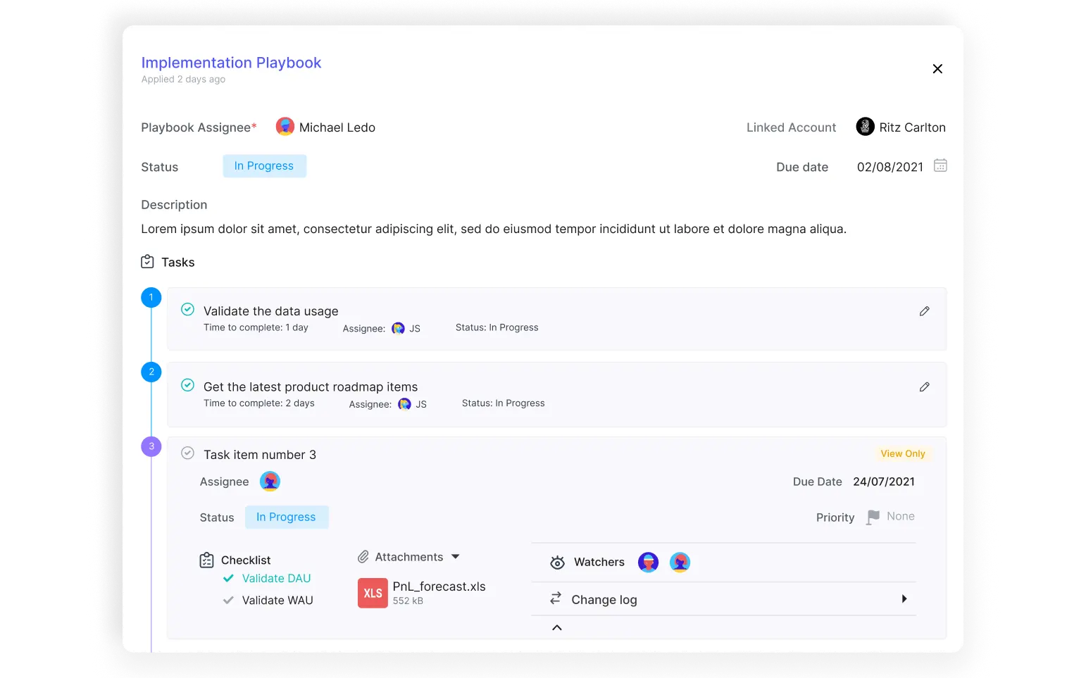
Configure Velaris to trigger playbooks and proactive alerts when risk scores drop or engagement declines. Automate workflows for churn prevention, milestone tracking, and customer check‑ins so teams can respond quickly and consistently.
Best practices for implementing an analytics dashboard
To get the most value from an analytics dashboard, customer success teams need to approach implementation strategically. The goal is not just to display data, but to ensure insights are accurate, actionable, and aligned with business outcomes. Following best practices helps teams avoid common pitfalls and build dashboards that truly drive customer success.
Define clear KPIs before setup
Start with measurable goals such as retention, churn reduction, product adoption, and upsell growth. Clear KPIs ensure the dashboard tracks what matters most and avoids unnecessary clutter.
Balance leading and lagging indicators
Most dashboards rely heavily on lagging indicators such as churn rate, GRR, and NPS. These metrics show what has already happened, but they offer limited time to change the outcome.
Add leading indicators that can signal future risk or growth 60–90 days in advance. These may include adoption velocity, stakeholder growth, QBR completion, engagement frequency, or progress against success-plan milestones. The strongest dashboards combine both types: leading indicators help teams decide where to act, while lagging indicators show whether those actions improved retention and expansion.
Ensure data integration across CRM, support, and product tools
A dashboard is only as strong as its data. Integrating CRM records, support tickets, and product usage analytics provides a unified view of the customer journey, eliminating blind spots.
Train teams to interpret and act on insights
Dashboards are effective only if teams know how to use them. Provide training on reading metrics, identifying risks, and triggering proactive actions so insights lead to meaningful outcomes.
Start simple, then scale with advanced features
Begin with core metrics and straightforward visualizations. As teams mature, add advanced features like predictive analytics, segmentation filters, and automated workflows to enhance decision‑making.
Rebuild your dashboard when you need to
A dashboard should be reviewed at least quarterly to ensure its metrics still reflect current customer success priorities. Warning signs include CSMs ignoring certain views, teams exporting data elsewhere, or metrics being tracked without leading to any action.
Separate unused metrics from metrics that are viewed but never acted on. The first may need better visibility or training, while the second may no longer support a useful decision. When removing a metric, preserve the underlying historical data so previous trends remain available for analysis and reporting.
Continuously refine based on feedback
Dashboards should evolve with customer needs and business priorities. Regularly gather feedback from users, adjust KPIs, and update layouts to keep the dashboard relevant and impactful.
Common mistakes to avoid
Even the best customer success dashboards can fail if they’re not designed thoughtfully. Teams often overload dashboards with too many metrics, ignore data quality, or fail to connect insights back to business goals.
Another common pitfall is treating dashboards as static tools instead of evolving systems that grow with customer needs. Avoiding these mistakes ensures your dashboard remains actionable and valuable.
Overloading dashboards with too many metrics
Including every possible metric creates clutter and confusion. Dashboards should highlight only the most relevant KPIs so teams can focus on what drives customer success.
Ignoring data quality and accuracy
Poor data inputs lead to misleading insights. Ensuring clean, accurate, and consistent data is critical for dashboards to provide reliable guidance.
Relying on vanity metrics
Some dashboard metrics look positive without showing whether customers are receiving value or likely to renew. Total login count, for example, can hide shallow usage if customers are not adopting important features.
Replace raw activity counts with quality-adjusted measures such as feature depth, milestone progress, stakeholder coverage, and whether each interaction led to a clear outcome or next step.
Failing to align dashboard insights with business goals
Dashboards must connect directly to objectives like retention, adoption, or revenue growth. Without alignment, insights remain interesting but not actionable.
Treating dashboards as static rather than evolving tools
Customer needs and business priorities change over time. Dashboards should be reviewed and updated regularly to stay relevant and continue driving impact.
Conclusion
Analytics dashboards are essential for customer success teams that want to move from reactive support to proactive growth. By defining clear KPIs, integrating reliable data, and leveraging features like health scoring, churn prediction, and automation, dashboards provide the visibility and insights needed to strengthen relationships and drive retention.
Velaris, which is highly rated on G2, makes this process simple by unifying data, enabling role‑specific views, and automating workflows that keep customers engaged. To see how Velaris can transform your customer success strategy, request a demo today and experience the power of actionable analytics firsthand.
Frequently Asked Questions
What’s the biggest sign your dashboard is working?
When teams shift from reactive firefighting to proactive engagement such as catching risks early, celebrating customer milestones, and linking success activities directly to revenue impact.
Can dashboards highlight customer milestones and achievements?
Dashboards can track onboarding completion, feature adoption, or renewal anniversaries, allowing teams to celebrate wins and strengthen relationships.
How do dashboards support executive decision making?
Executives can use high‑level views to connect customer success metrics directly to revenue, retention, and growth strategies making success measurable at the boardroom level.
How can a customer success dashboard support 90-day renewal forecasting?
Configure the dashboard to show every renewal due within the next 90 days alongside account health, product adoption, stakeholder engagement, support issues, and recent sentiment. This gives teams a rolling view of which renewals are healthy, uncertain, or at risk while there is still time to intervene.
Each account should also have a forecast category, expected renewal value, named owner, next action, and target date.
How do dashboards evolve with AI and automation?
Modern dashboards can integrate AI tools to predict churn, recommend upsell opportunities, and trigger automated workflows turning insights into immediate action.
Do dashboards help identify product improvement opportunities?
By analyzing support tickets and usage patterns, dashboards reveal where customers struggle, guiding product teams to prioritize fixes and new features.
What’s the role of visualization in dashboards?
Clear charts, graphs, and intuitive layouts make complex data easy to understand. Good visualization ensures teams act on insights quickly instead of getting lost in numbers.

The Velaris Team
A (our) team with years of experience in Customer Success have come together to redefine CS with Velaris. One platform, limitless Success.





Velaris is an AI-native Customer Success Platform built for mid-market and enterprise B2B SaaS teams. From customer health scoring and churn prediction to onboarding automation, renewals, and expansion workflows, Velaris helps recurring revenue teams understand account health, reduce churn, and scale customer success with greater visibility and control.